Visualizations with ggplot2
2022-10-26
Goal today – Template HVTN figure
ggplot2 - the quintessential example
Basic template:
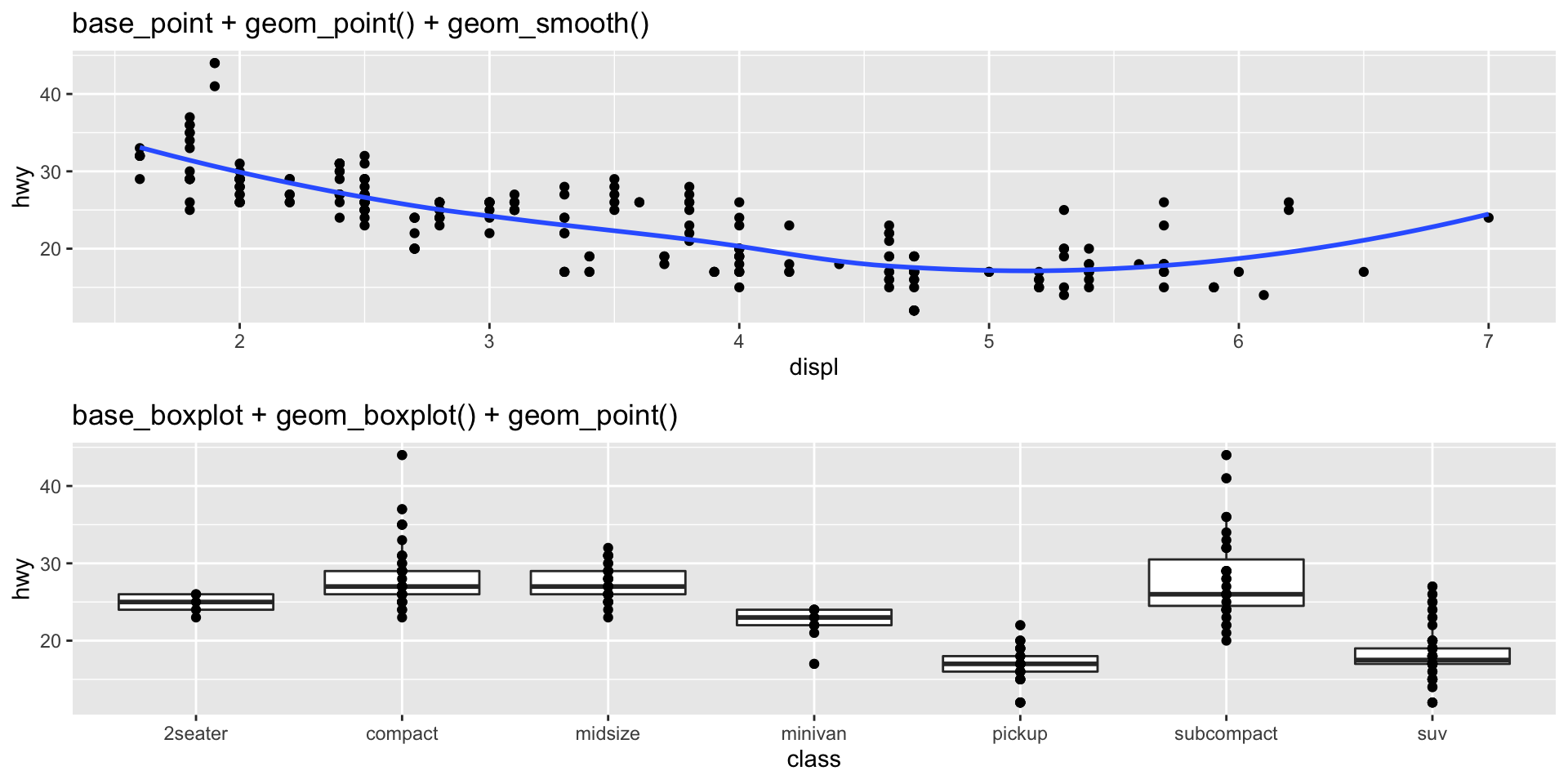
In action:
ggplot2 vs. base R plot
- For simple plots, base plot can be useful.
- Many R packages and objects use
plot()on the backend, so knowledge helpful.
- Many R packages and objects use
- The grammar of ggplot2 eases extension into complex plots.
- Ex. mapping of colors and legend generation is automatic within ggplot2.
par(mfrow = c(1,2))

plot(mpg$displ, mpg$hwy)

plot(x = mpg[mpg$class == "compact", ]$displ,
     y =mpg[mpg$class == "compact", ]$hwy,
     col = "orange", xlim = c(1.5, 7),
     ylab = "hwy", xlab = "displ")

points(x = mpg[mpg$class == "2seater", ]$displ,
       y = mpg[mpg$class == "2seater", ]$hwy,
       col = "red")

legend(x = 3, y = 40, c("compact", "2seater"),
       col = c("orange", "red"), pch = 1)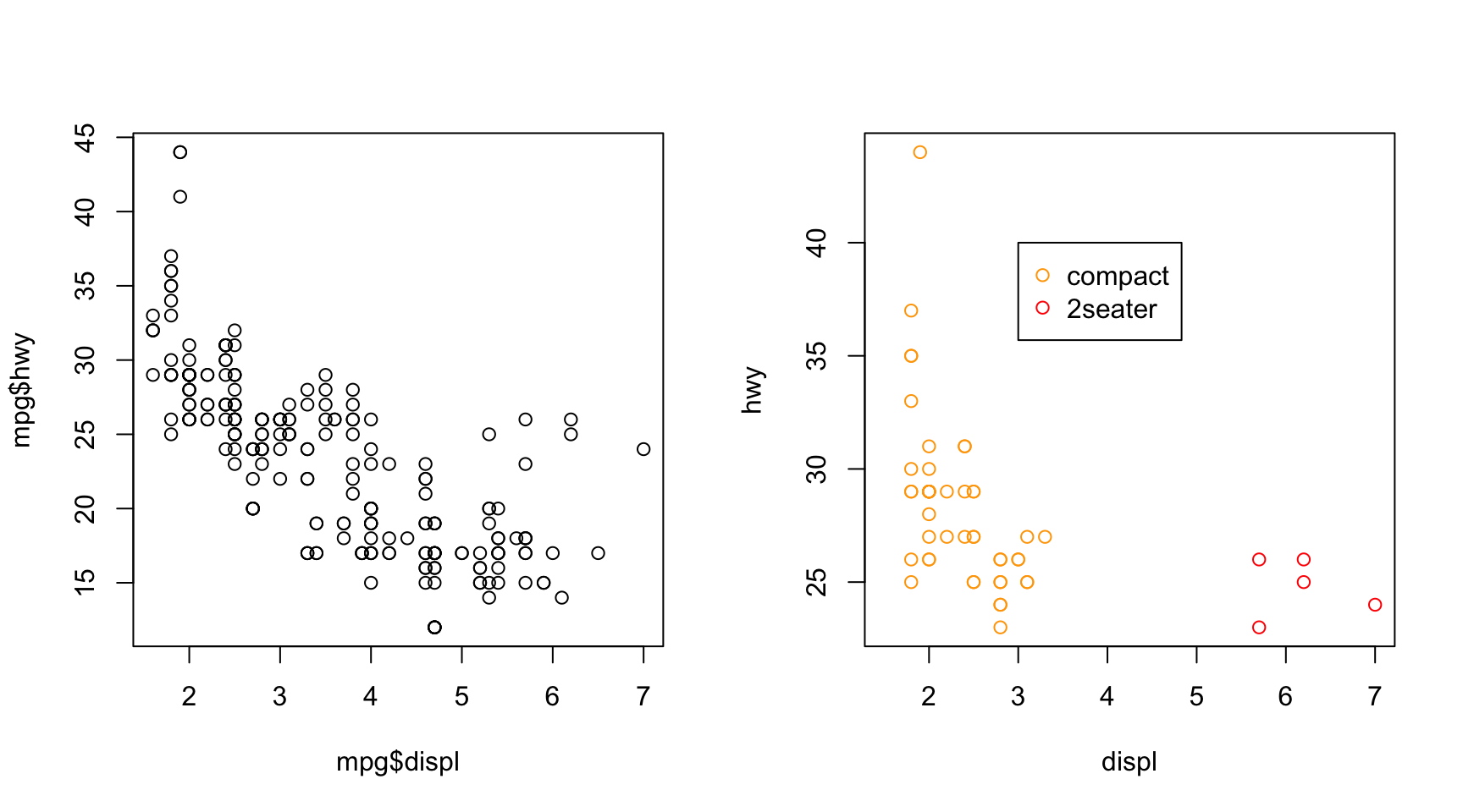
Common Geometries
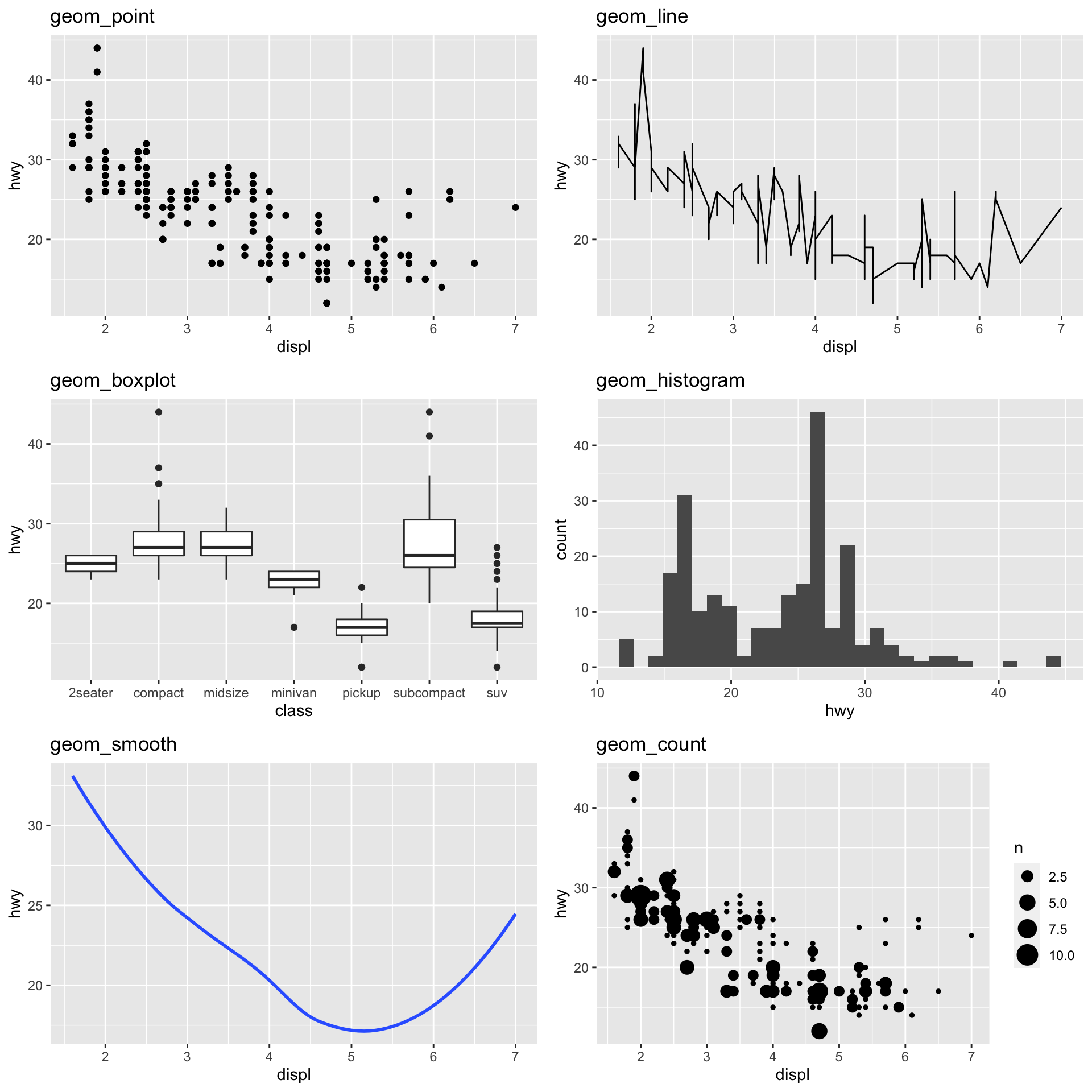
| Type | Function |
|---|---|
| Scatter/Point | geom_point() |
| Line | geom_line() |
| Box plot | geom_boxplot() |
| Bar plot | geom_bar(), geom_col() |
| Histogram | geom_histogram() |
| Density | geom_density() |
| Regression/Spline | geom_smooth() |
| Text | geom_text() |
| Vert./Horiz. Line | geom_{vh}line() |
| Jittered Point | geom_jitter() |
| Count | geom_count() |
https://eric.netlify.com/2017/08/10/most-popular-ggplot2-geoms/
Layering (combining) Geometries
Plots with multiple geometries can be quickly made by layering.
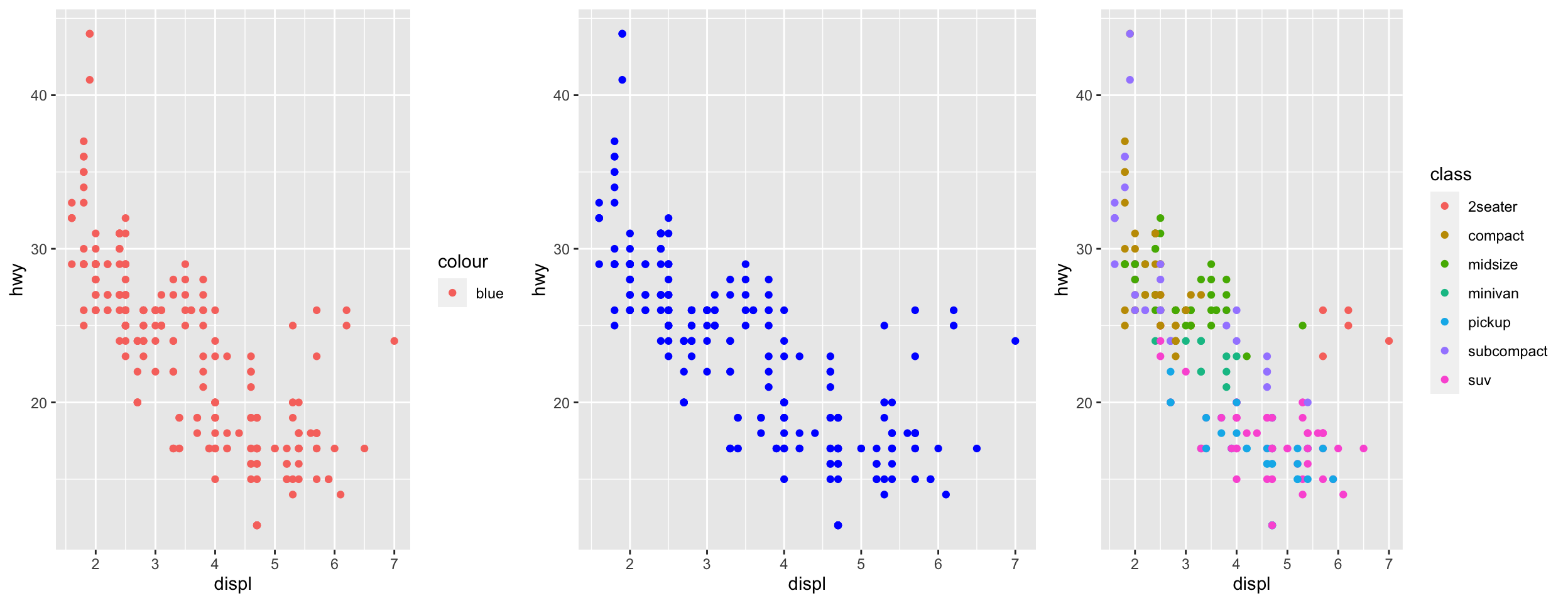
Aesthetic Settings vs. Mappings
- Setting: an aesthetic independent of data, assigned outside of the
aes()argument.- This must be assigned within the appropriate geometry.
- Assigning a setting within
aes()is a data mapping, ggplot2 will assume this a variable with a single value.
Continuous vs. Discrete Data
- Aesthetic mappings depend on type of data.
- ggplot2 will assume numeric classes are continuous.
- If the aesthetics requires a certain data, an informative error will display.
- Depending on geometry, aesthetics may only take one type of data (ex. linetype must be categorical class).
- If the aesthetic is flexible, the plot may appear odd (potentially with warning).
- If the aesthetics requires a certain data, an informative error will display.
- You can wrap variables with functions within
aes()calls.- Ex.
aes(y = log10(magnitude)),aes(y = pmax(1, magnitude)). - Trick: Wrap numeric variables in
factor()if need discrete mapping.
- Ex.
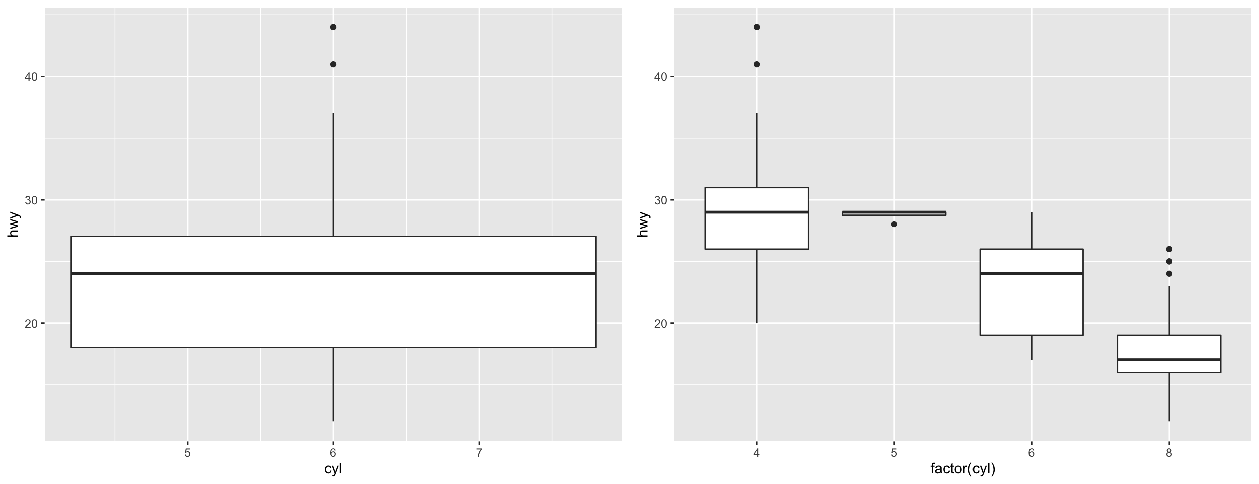
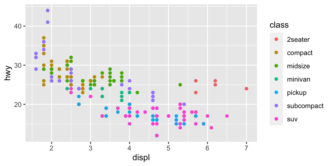
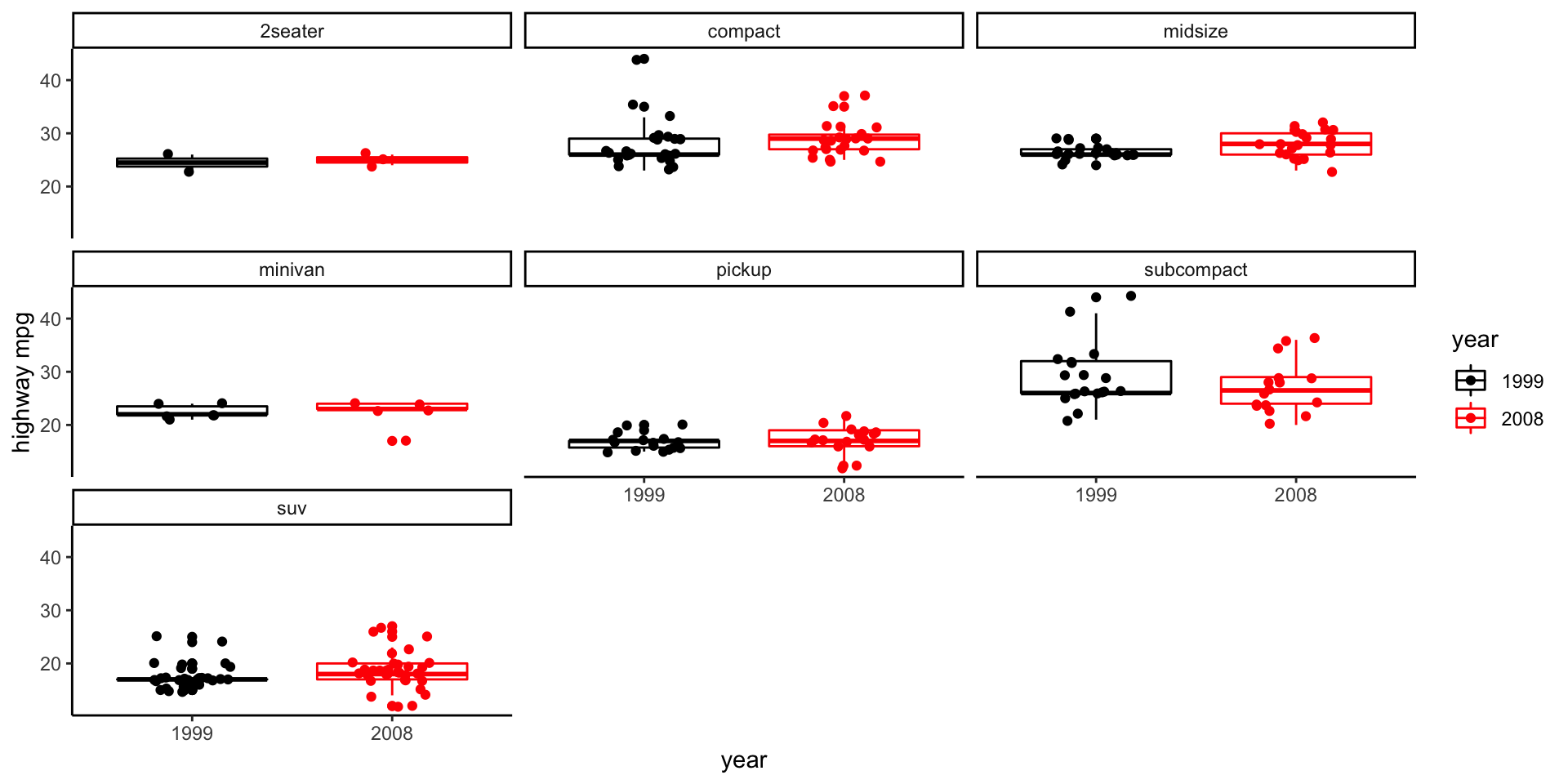
Box plot example (mpg) - v1
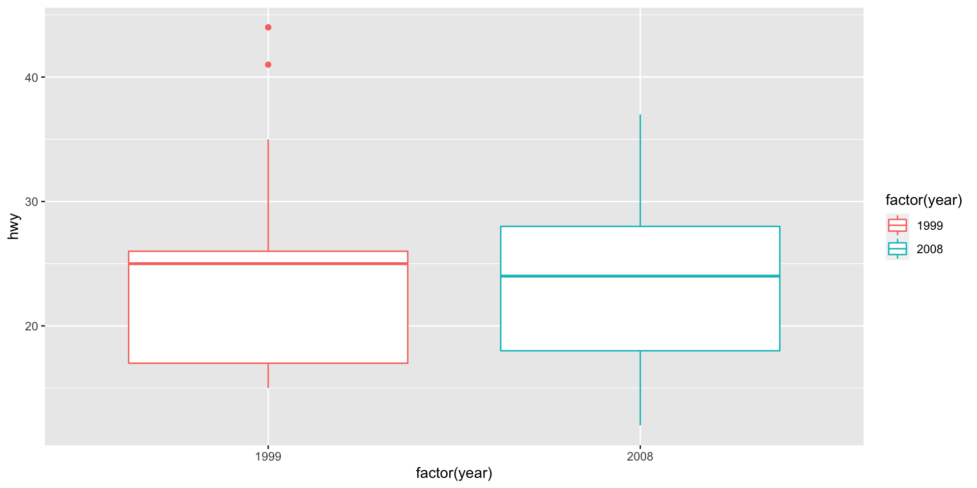
Why Factor?
Discrete and Manual Scale Functions
- Discrete scales (
scale_*_discrete()): tinkering with palettes, labels, and breaks.- Adjusting discrete x- or y-axis (
scale_x_discrete,scale_y_discrete) is not always intuitive (e.g., use limits instead of breaks).
- Adjusting discrete x- or y-axis (
- Manual scales (
scale_*_manual): explicit mapping of data level to a setting.- Make sure breaks and labels match as expected.
scale_color_manual(breaks = c("A", "B"), labels = c("A", "B"), values = c("red", "blue"))
Manual labeling
- Use named vectors for consistent repeated scale mappings.
- Ex. Same vaccine group color and label assignments across many plots.
- Note: Use ` ` for non-standard R column names.
- Not shown here: reference data frame (or list) linking breaks, labels, colors
breaks = dataframe$breaks, labels = dataframe$labels, values = dataframe$colors
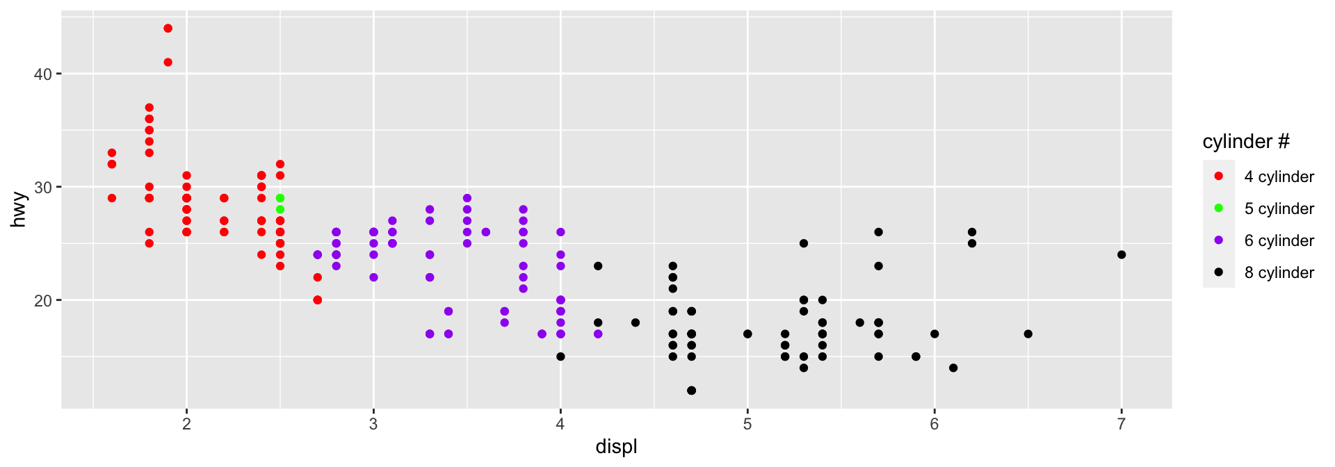
cyl_colors = c(`4` = "red", `5` = "green",
               `6` = "purple", `8` = "black")

cyl_labels =  paste(c(4, 5, 6, 8), "cylinder")
names(cyl_labels) = c(4, 5, 6, 8)

ggplot(data = mpg,
       aes(x = displ, y = hwy,
           colour = factor(cyl))) +
  geom_point() +
  scale_color_manual("cylinder #",
                     values = cyl_colors,
                     labels = cyl_labels)
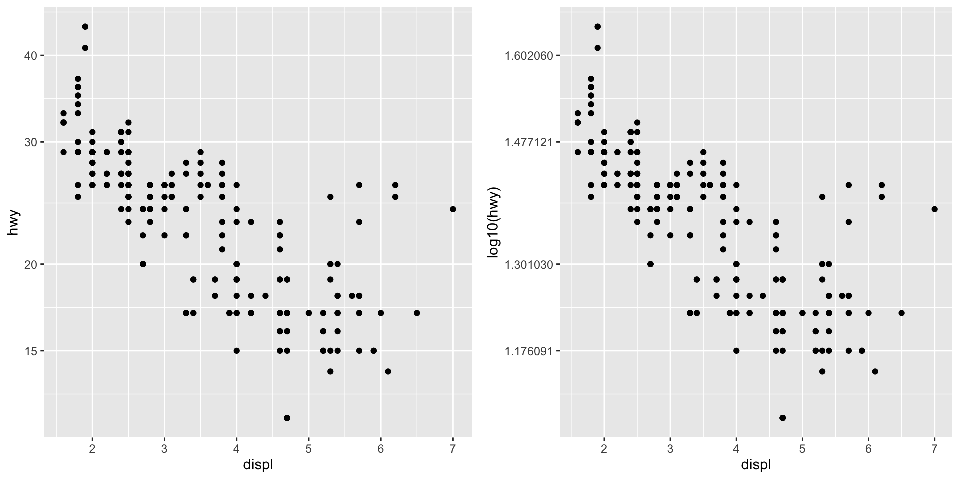
Continuous Scales
- Continuous scale manipulation tends to apply to continuous data mapped to axes.
- Common exceptions: heat maps, point size mapping.
- The default x- and y-axis scales are
scale_x_continuousandscale_y_continuous.- Most common alternative, log-transform:
scale_x_log10andscale_y_log10. - Plotting on the log-scale vs. log-transformed data (units are different).
- Other transformations are possible.
- Most common alternative, log-transform:
- More info: https://ggplot2.tidyverse.org/reference/index.html#section-scales
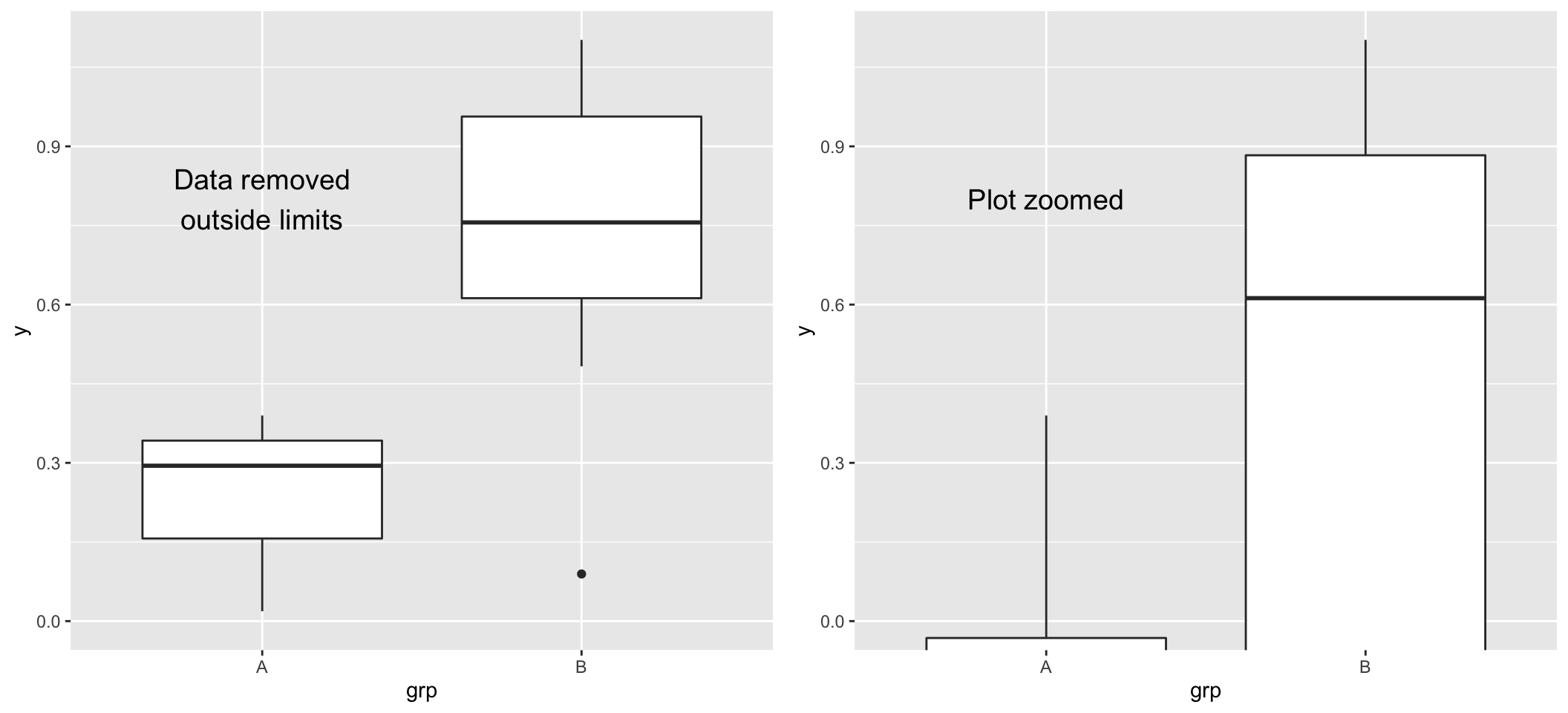
Coordinate functions
- Coordinate functions adjust the coordinate system of the plot.
- Not direct transformation to the data: different than scale mappings. Important when summary measures (e.g., median) are computed by ggplot2.
- Always read the warnings.
- Common coordinate functions:
coord_cartesian(): default. Limit arguments can be used to zoom plot (Example).coord_flip(): flips x and y on the plots.coord_polar(): use polar coordinate system.coord_fixed(): fixes aspect ratio, make ‘square’ plots.
Box plot example (mpg) - finalize
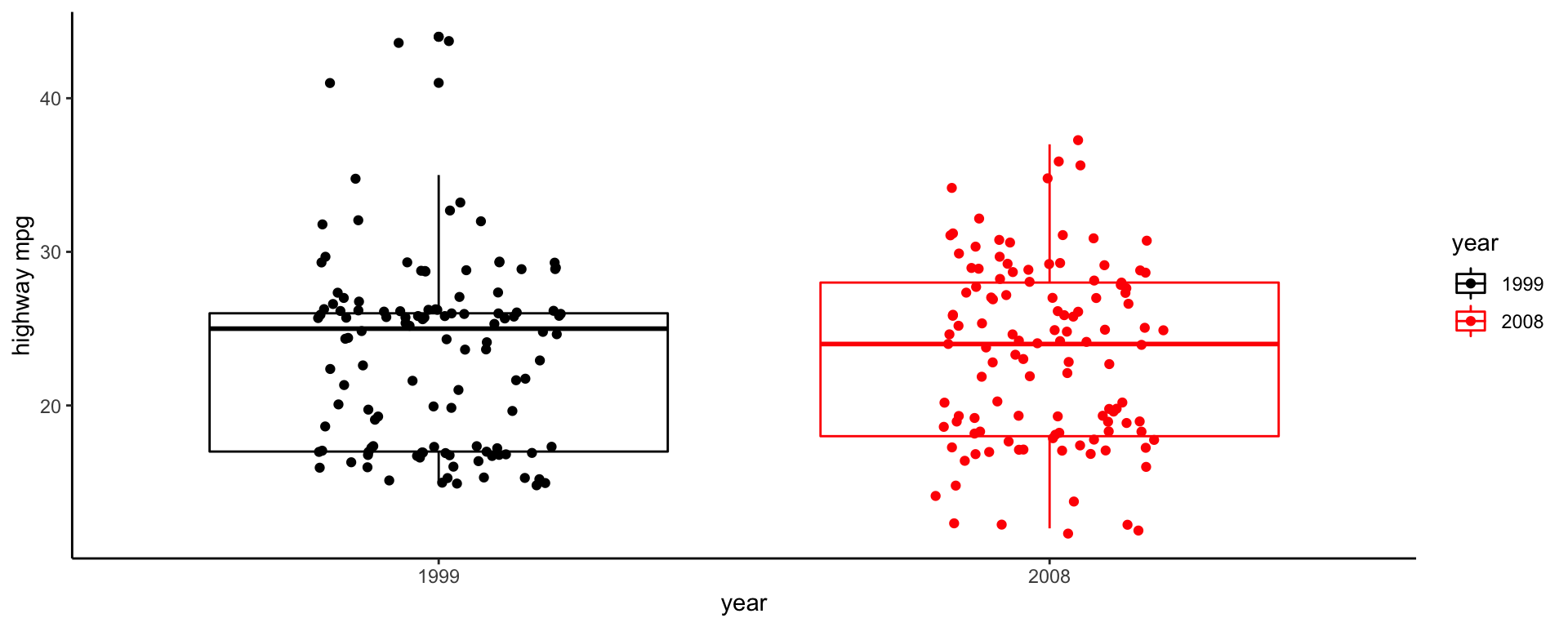
Box plot example (mpg) - faceting
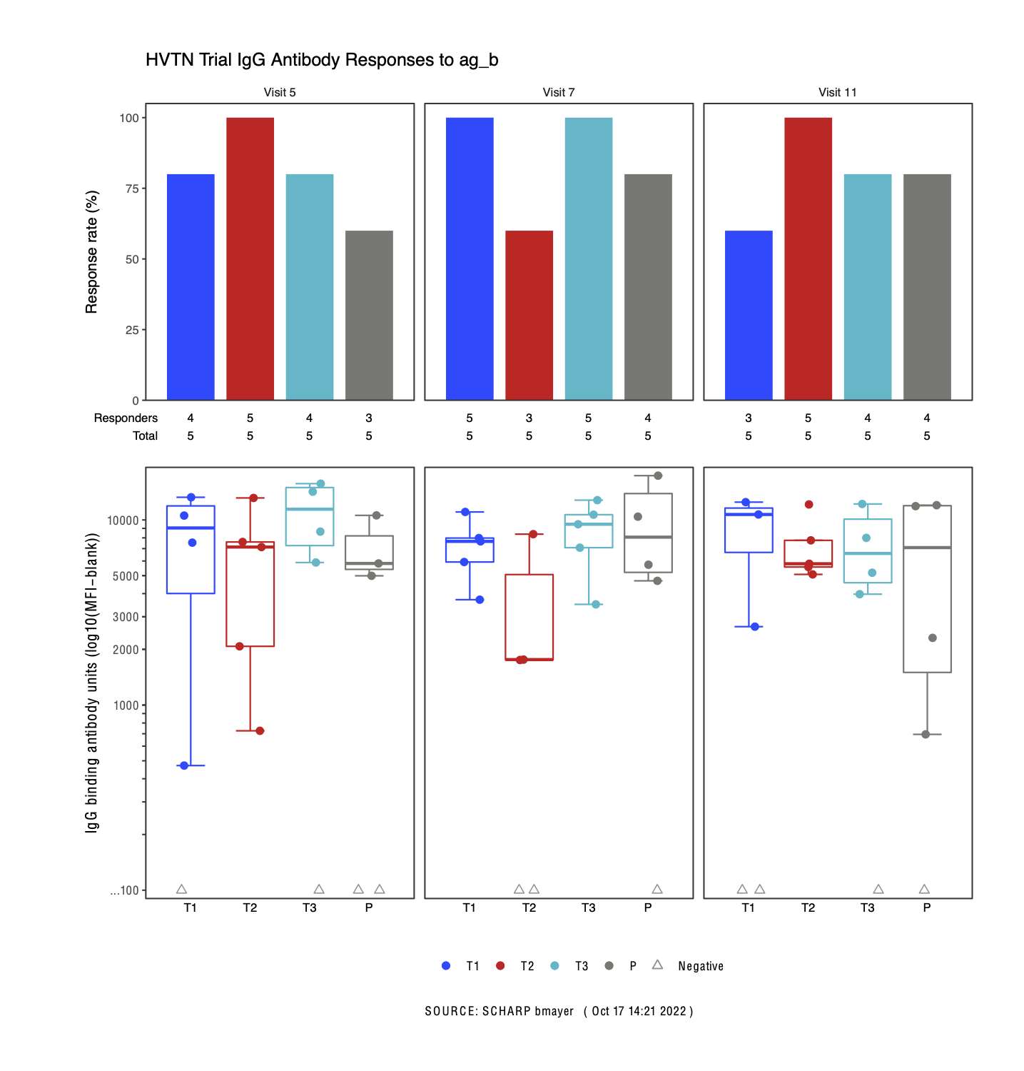
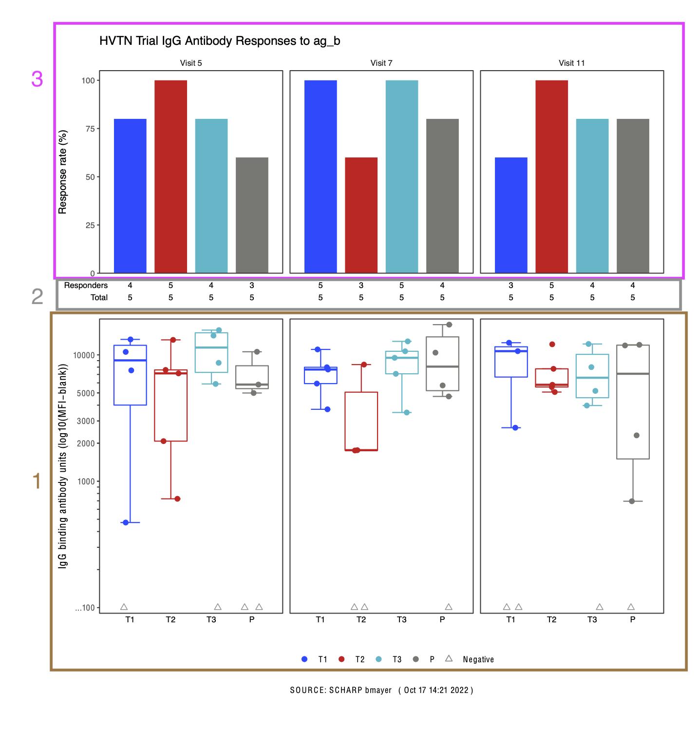
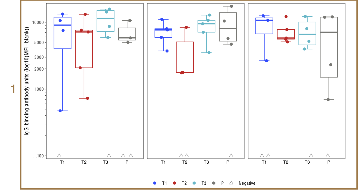
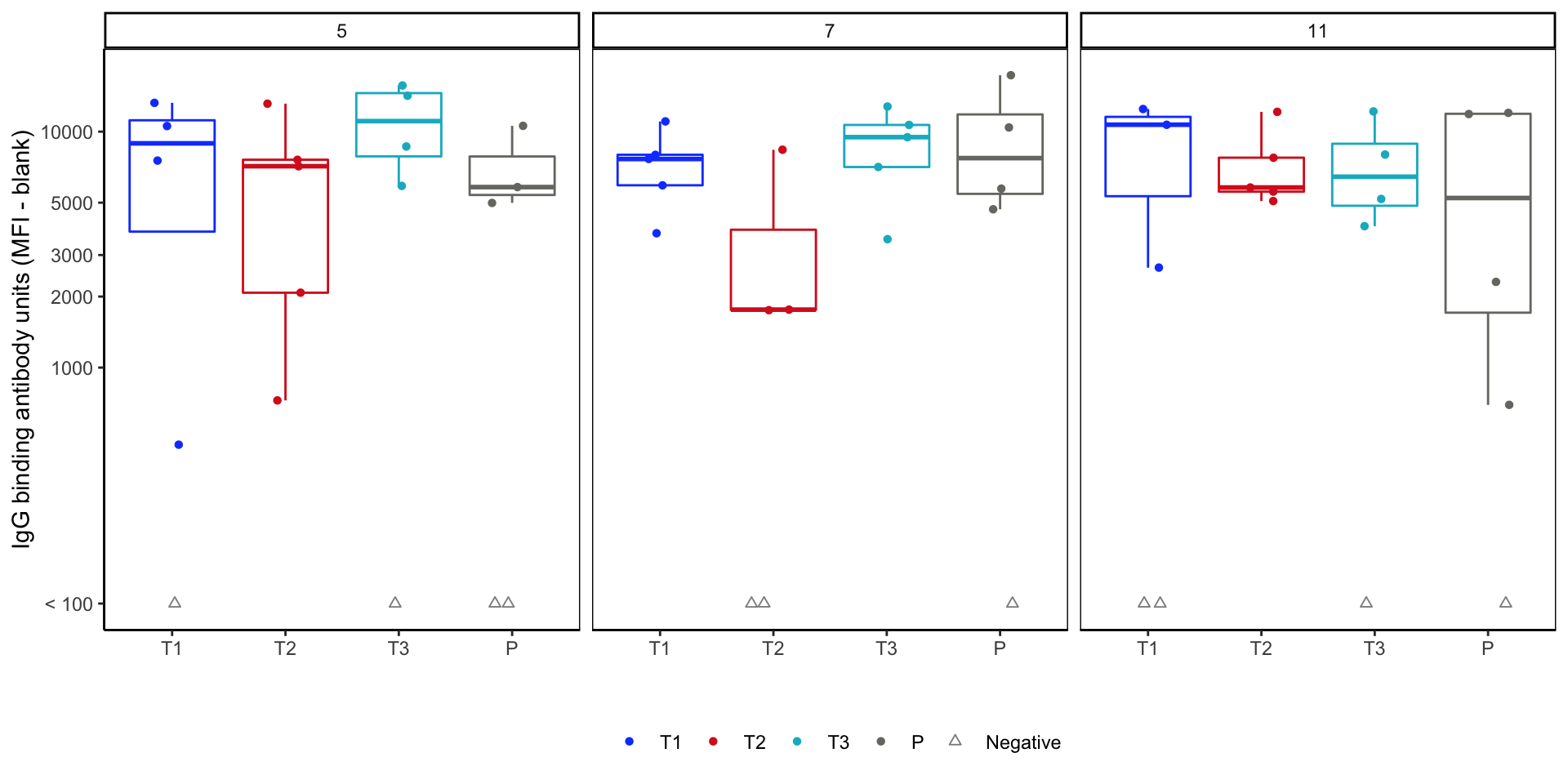
HVTN Example
Figure can be built in 3 parts. Focus just on magnitude plot.
Magnitude plot - Mapping (discussion)
Rows: 60
Columns: 12
$ labid         <chr> "Frankenstein", "Frankenstein", "Frankenstein", "Franken…
$ pub_id        <int> 1, 2, 3, 4, 5, 6, 7, 8, 9, 10, 11, 12, 13, 14, 15, 16, 1…
$ rx_code       <chr> "P", "T1", "T2", "T3", "P", "T1", "T2", "T3", "P", "T1",…
$ visitno       <dbl> 5, 5, 5, 5, 5, 5, 5, 5, 5, 5, 5, 5, 5, 5, 5, 5, 5, 5, 5,…
$ isotype       <chr> "IgG", "IgG", "IgG", "IgG", "IgG", "IgG", "IgG", "IgG", …
$ antigen       <chr> "ag_b", "ag_b", "ag_b", "ag_b", "ag_b", "ag_b", "ag_b", …
$ gene          <chr> "gp120", "gp120", "gp120", "gp120", "gp120", "gp120", "g…
$ clade         <chr> "B", "B", "B", "B", "B", "B", "B", "B", "B", "B", "B", "…
$ fi_bkgd       <dbl> 11985.2477, 6188.5244, 6611.3519, 12819.1074, 5344.8246,…
$ fi_bkgd_blank <dbl> 6164.825, 6194.799, 4535.088, 4173.354, 5556.441, 6911.0…
$ delta         <dbl> 5820.4230, 1.0000, 2076.2640, 8645.7529, 1.0000, 471.266…
$ response <dbl> 1, 0, 1, 1, 0, 1, 1, 0, 1, 1, 1, 1, 1, 1, 1, 1, 0, 1, 1,…- Geometry?
- Aesthetic Data Mappings
- Which data fields are used in the plot?
- How are they mapped?
- Any transformations?
- Facets?
- Challenges?
Response magnitude plot - v1
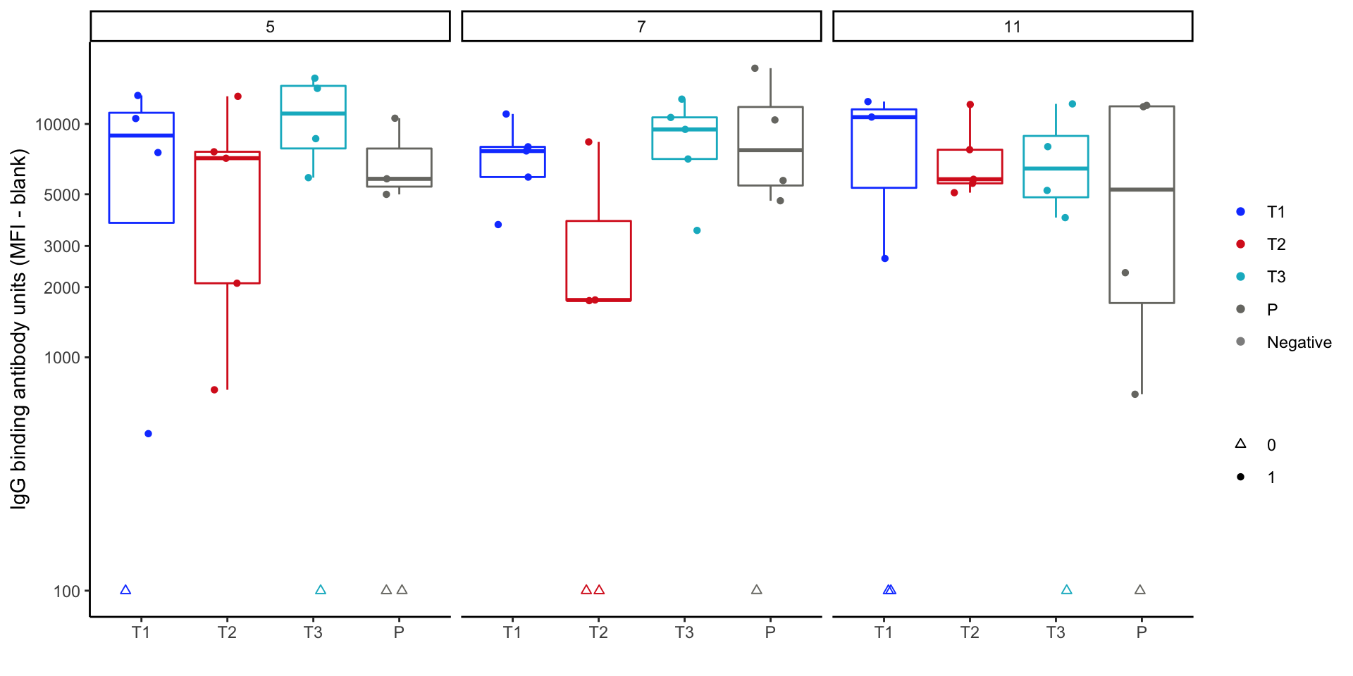
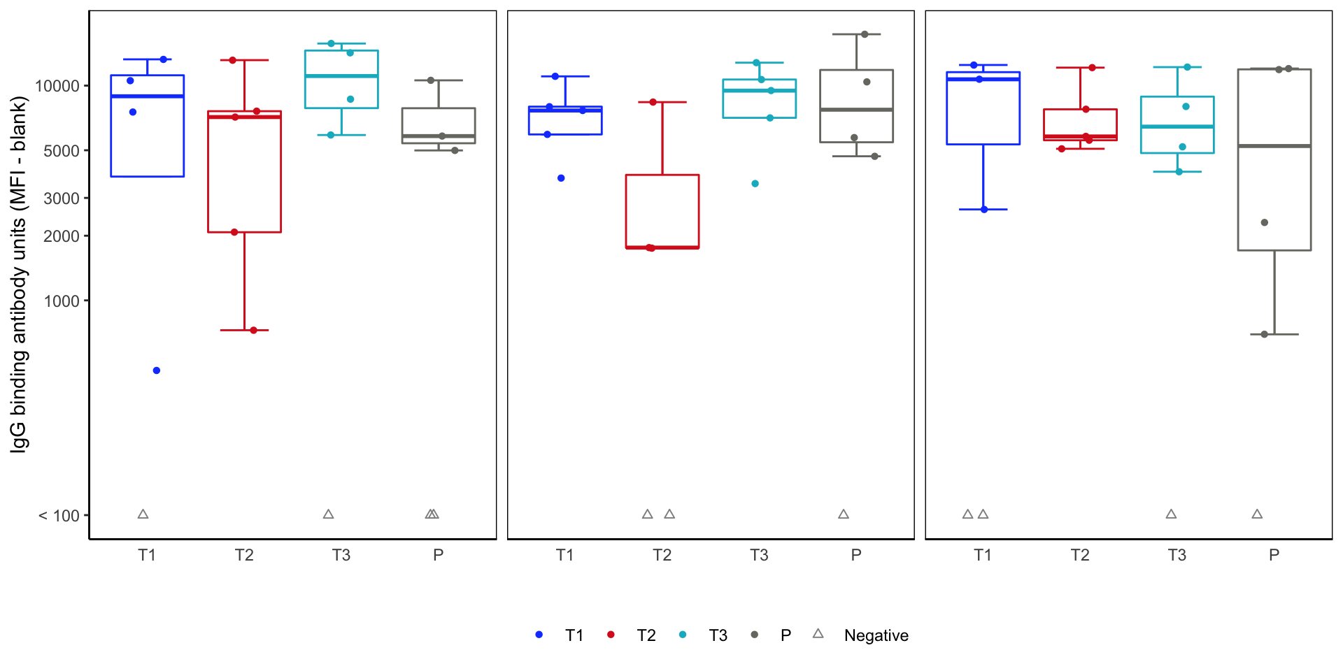
Response magnitude box plots - version 2
- To do before final figure: tinkering with
theme().- Remove panel (strip) labels for stacking.
strip.text = element_blank() - Wrap individual plots with boxes.
panel.background = element_rect(color="black").
- Remove panel (strip) labels for stacking.
Finalized magnitude figure
Finishing HVTN Example
Walkthrough parts 2 and 3. Code is in the worksheet.
Responder total tally - step 1
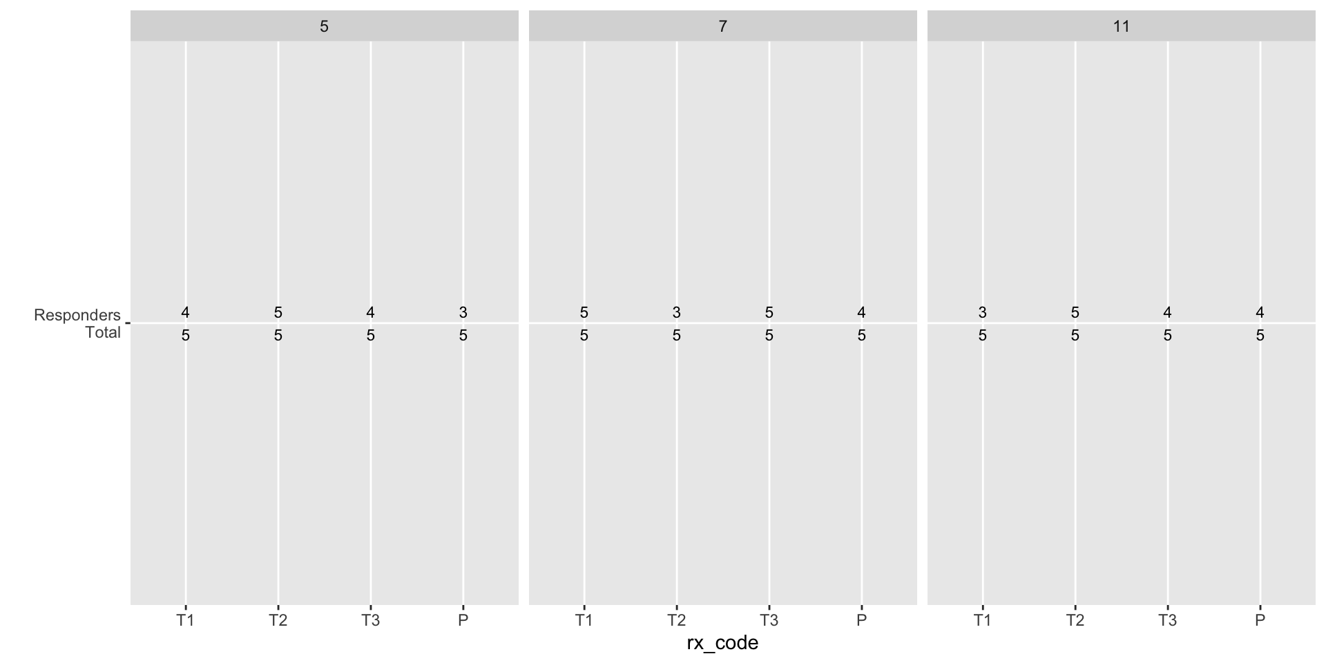
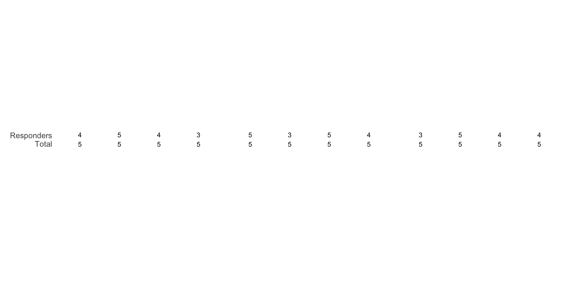
Responder total tally - finalize
Response rate barplot
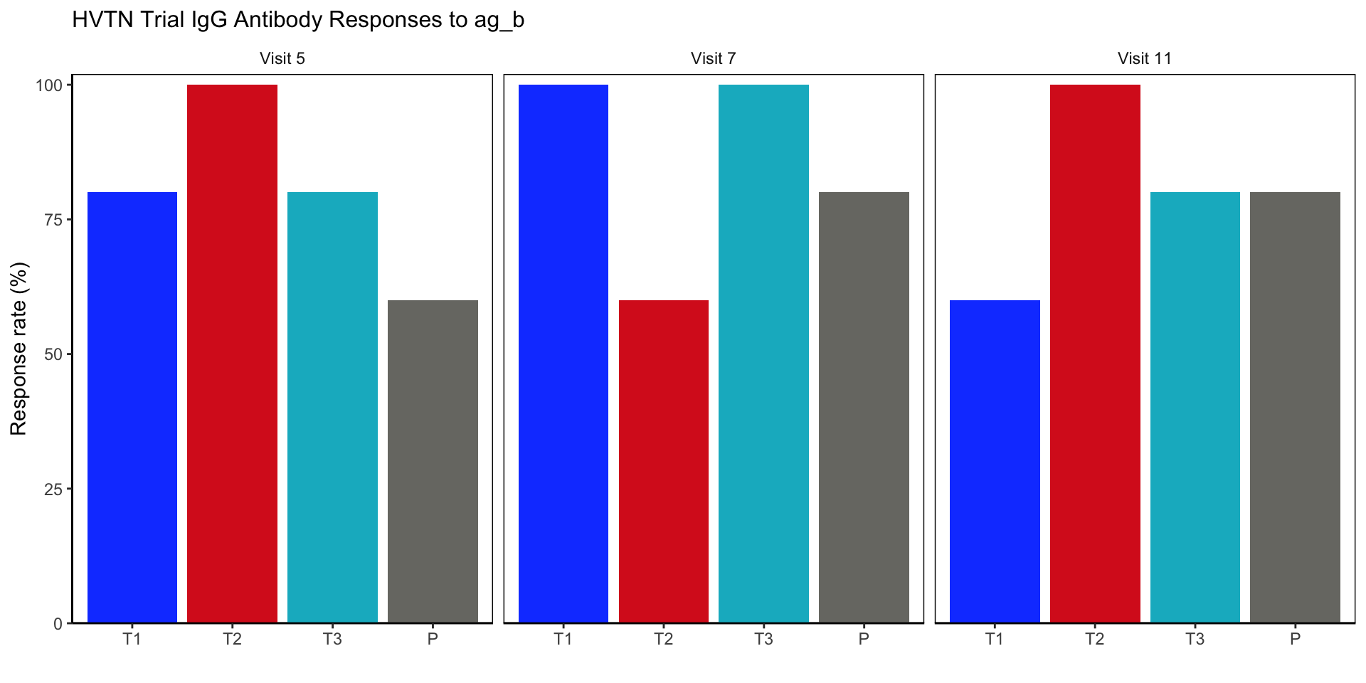
Final Figure
